
Case Studies
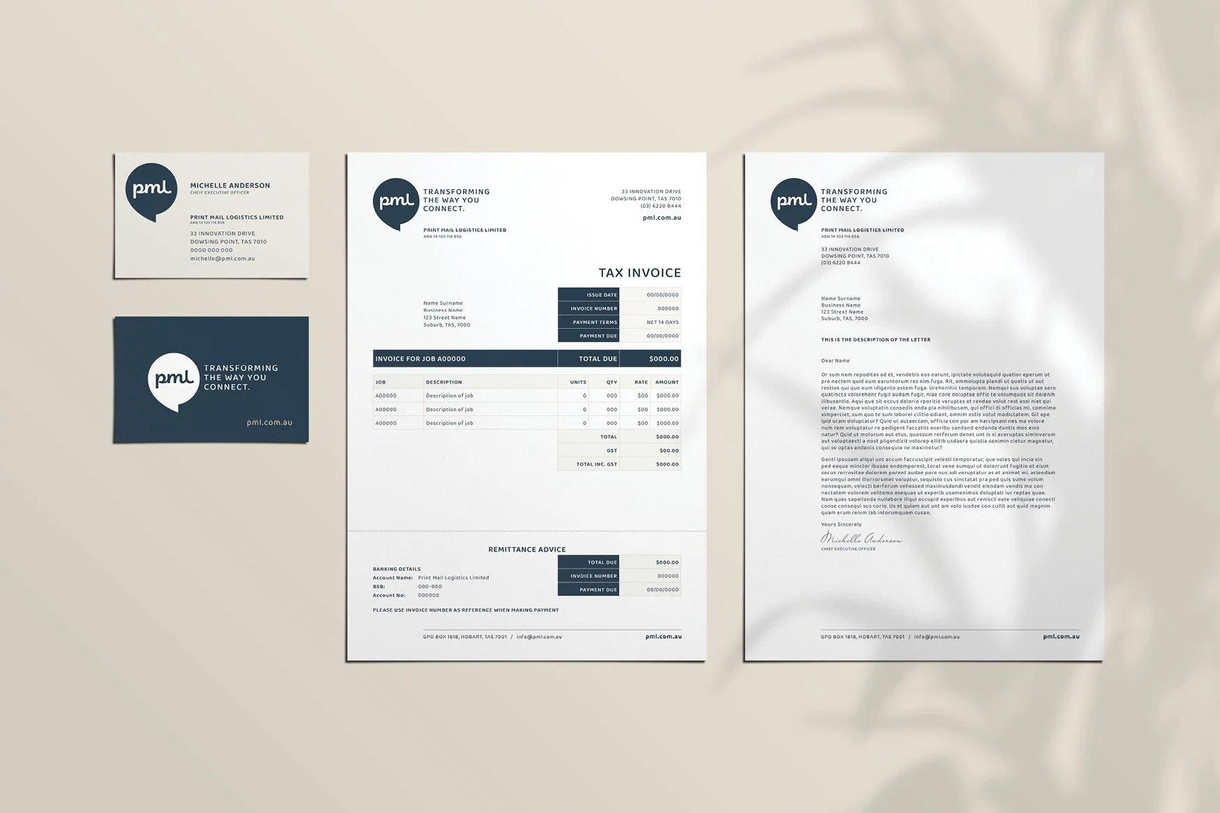
CLIENT
PRINT MAIL LOGISTICS, HOBART
PROJECT
BRANDING, SOCIALS, MARKETING COLLATERAL, WEBSITE
The Brief
PML required a full rebrand and communications rollout to modernise its positioning and clearly articulate complex, multi-channel communication services.
Our Approach
We developed a comprehensive brand system across digital, print and campaign assets, using structured layouts, clear hierarchy and a confident visual language to simplify and clarify messaging.
The Outcome
The result is a cohesive, scalable brand that improves understanding, builds credibility, and supports consistent communication across a wide range of applications.


CLIENT
SEALASASH, HOBART
PROJECT
BRANDING, SOCIALS, MARKETING COLLATERAL, SIGNAGE
The Brief
Sealasash required a comprehensive rebrand and campaign rollout to reposition the business as a premium leader in window restoration and modern glazing solutions.
Our Approach
We developed a cohesive brand system spanning print, digital, social and vehicle livery, combining refined typography, architectural imagery and a confident messaging framework to balance master craftsmanship with performance.
The Outcome
The result is a unified, premium, high-impact brand presence that elevates perception, strengthens market positioning, and supports consistent communication across all customer touchpoints.


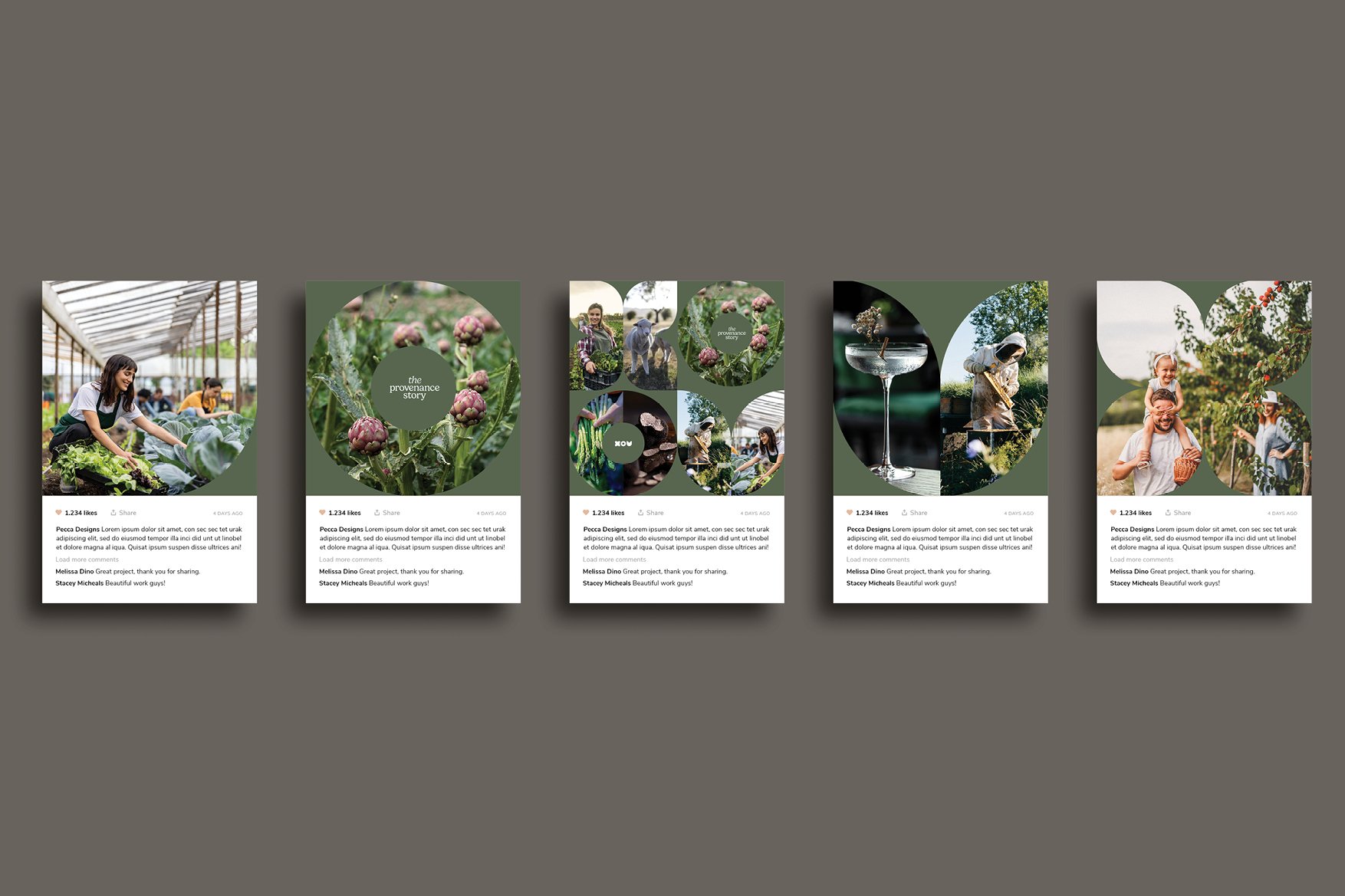
CLIENT
THE PROVENANCE STORY
PROJECT
BRANDING, SOCIALS, WEBSITE
The story behind what we make.
The Provenance Story is a concept identity designed to bring together the many layers behind a product, from the land it comes from, to the people who shape it, and the experiences it creates. Rather than focusing on a single outcome, the approach reveals the full context of what is being made, allowing brands to communicate in a more connected and human way.
The Challenge
Many brands operate across multiple touchpoints, production, process, people and experience, yet struggle to communicate this breadth clearly. Content often becomes fragmented, with each element shown in isolation, resulting in a diluted or incomplete story. This project explores how a single identity can unify these layers into a cohesive and scalable visual approach.
The Approach
The identity is built around a flexible visual language that allows multiple images to coexist in a structured and intentional way. By combining different perspectives, product, process and place, the design creates a more complete picture of what a brand represents.
Through considered cropping, scale and composition, the approach balances contrast and cohesion, allowing the identity to adapt across different sectors, tones and content types while maintaining a consistent visual presence.


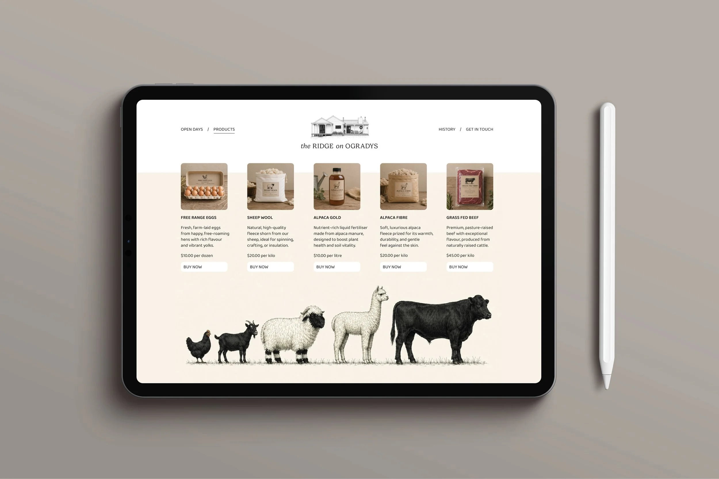
CLIENT
THE RIDGE ON OGRADYS
PROJECT
BRANDING, ILLUSTRATION, WEBSITE, PACKAGING, SOCIALS
The Brief
To create a brand and digital presence for a small-scale boutique farm, focused on direct-to-consumer sales and transparency of production.
Our Approach
We developed an authentic identity that reflects the rhythm and honesty of small-scale farming. The brand system balances warmth and restraint, pairing refined typography with tactile, grounded imagery. A key visual device was introduced through a series of illustrated livestock, creating a distinctive and ownable shorthand for product origin. The website was designed to seamlessly combine storytelling and commerce, allowing customers to understand not just what they’re buying, but where it comes from and how it’s produced.
The Outcome
The result is a cohesive brand and e-commerce experience that feels calm, authentic and trustworthy, supporting direct sales while reinforcing the values of transparency, care and small-scale production.


CLIENT
AUSTRALIAN SEAFOOD NUTRITION, CONCEPTUAL
PROJECT
INFOGRAPHICS, LONG FORM DOCUMENTS, SOCIALS
The Brief
Australian Seafood Nutrition needed a clear, credible way to communicate the nutritional benefits of Australian seafood consumption to consumers, combining science-led information with an accessible, engaging format.
Our Approach
We developed a clean, editorial-style system that pairs hero seafood imagery with simplified nutritional callouts, structured content and intuitive iconography. The design was built to work seamlessly across print and mobile, ensuring clarity and consistency in every touchpoint.
The Outcome
The result is a refined, easy-to-digest information suite that elevates perception, supports informed choices, and positions Australian seafood as both premium and nutritionally valuable.


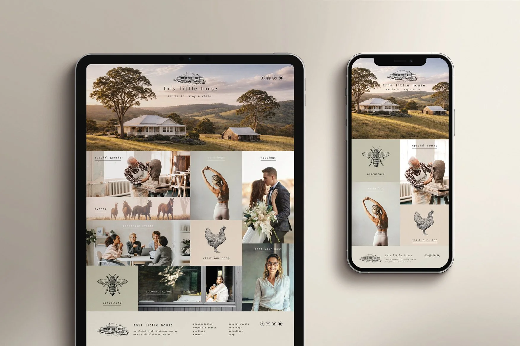
CLIENT
THIS LITTLE HOUSE, GIPPSLAND
PROJECT
BRANDING, WEBSITE, MAGAZINE ADS
The Brief
This Little House required a cohesive brand and marketing suite to position it as a premium rural destination, appealing to accommodation, workshop and wedding audiences.
Our Approach
We created a refined, editorial-style design system using a modular grid, soft neutral palette and considered typography, supported by curated imagery and subtle illustrations.
The Outcome
The result is a cohesive, flexible brand across digital and print that elevates the offering and clearly communicates a premium, design-led experience.

CLIENT
NIPPY DIPPERS. MORNINGTON PENINSULA
PROJECT
BRANDING, WEBSITE, MAGAZINE AD, SOCIALS
The Brief
Nippy Dippers required a brand and campaign rollout to grow awareness and engagement around their bay swimming community, while maintaining an authentic, welcoming feel.
Our Approach
We developed a light, uplifting visual language led by natural tones, candid photography and soft typography, creating a calm, editorial-style system adaptable across digital and print.
The Outcome
The result is a cohesive, engaging brand presence that builds community connection, supports campaign rollout, and reinforces a sense of wellbeing and belonging.


CLIENT
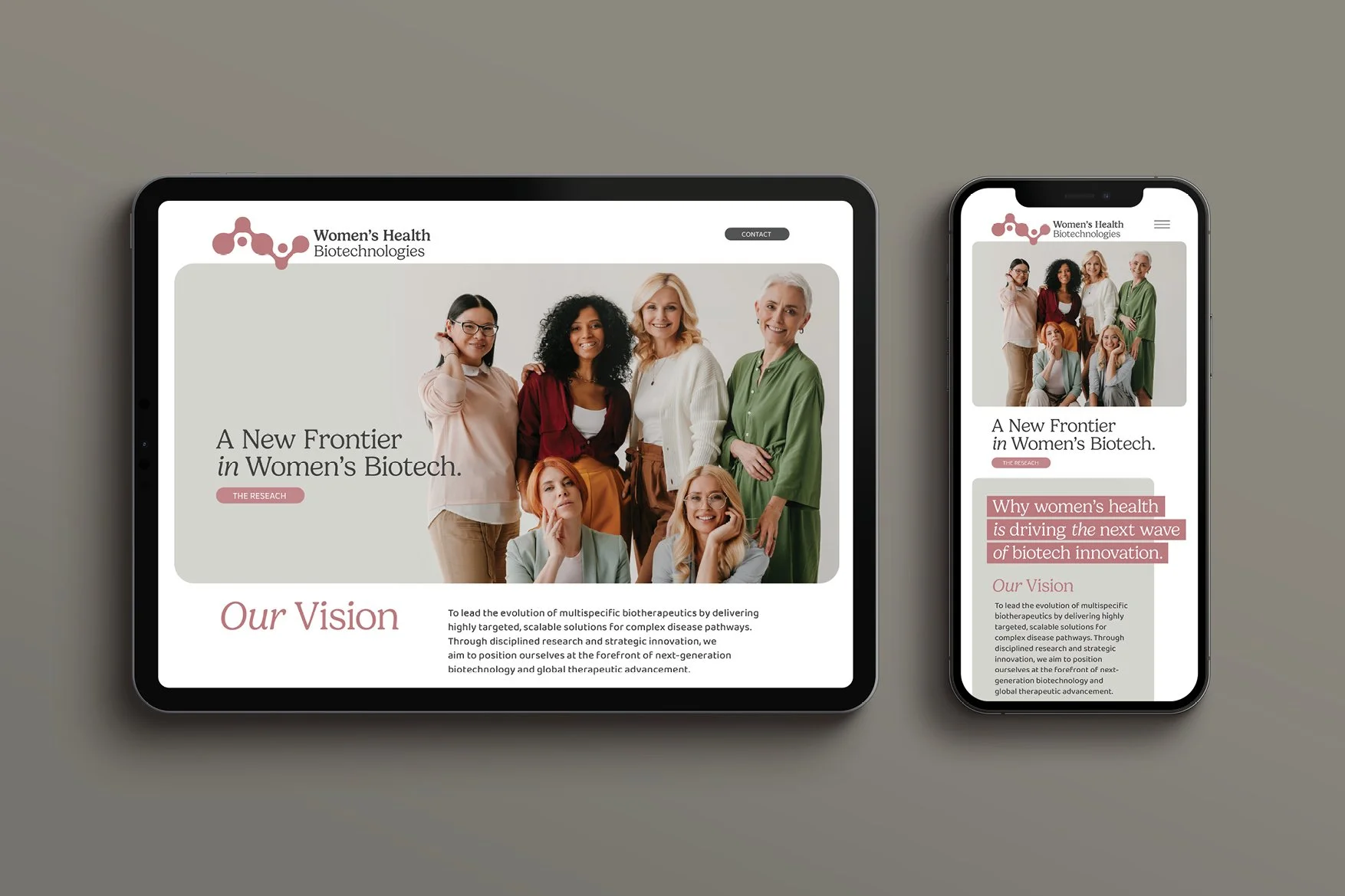
WOMEN’S HEALTH BIOTECHNOLOGIES, NATIONAL
PROJECT
BRANDING, WEBSITE, MAGAZINE EDITORIALS
The Brief
Women’s Health Biotechnologies needed a brand and communication platform that could articulate complex scientific innovation for listing publicly on the ASX, while remaining human, accessible and purpose-led.
Our Approach
We developed a refined identity that balances clinical credibility with warmth, pairing structured typography and soft colour accents with authentic, diverse imagery. The system was designed to translate seamlessly across print and digital, maintaining clarity while elevating the narrative around women’s health.
The Outcome
The result is a confident, modern brand that humanises biotech, strengthens engagement, and positions the organisation at the forefront of innovation in women’s health.

CLIENT
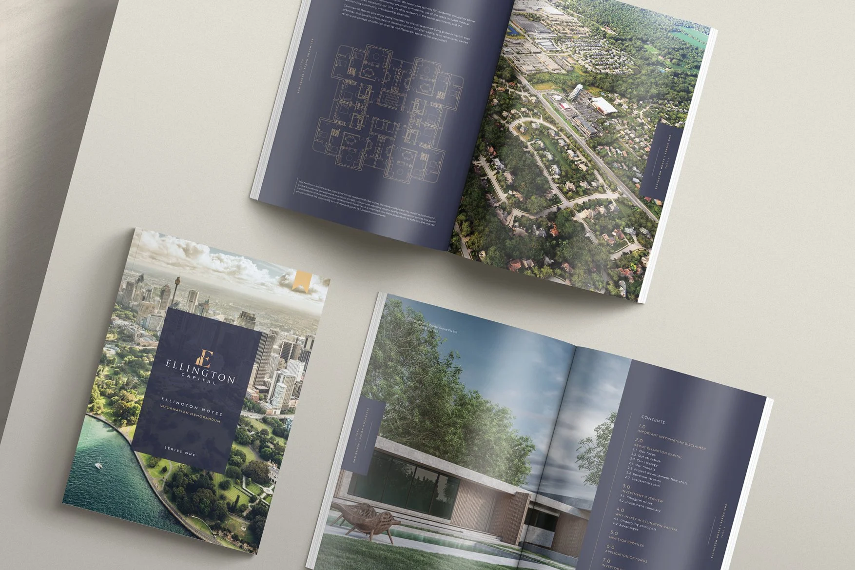
ELLINGTON CAPITAL, FOR SMITH & ASSOCIATES, HOBART
PROJECT
LONG FORM INVESTMENT MEMORANDUM, SOCIALS
The Brief
Ellington Capital required a premium investment memorandum and campaign assets to position Series One as a credible, high-value opportunity.
Our Approach
We created a sophisticated visual system using a restrained palette, strong typography and architectural imagery to convey clarity, confidence and investment quality.
The Outcome
The result is a polished, investor-ready suite that elevates perception, builds trust, and supports clear communication of the opportunity.

CLIENT
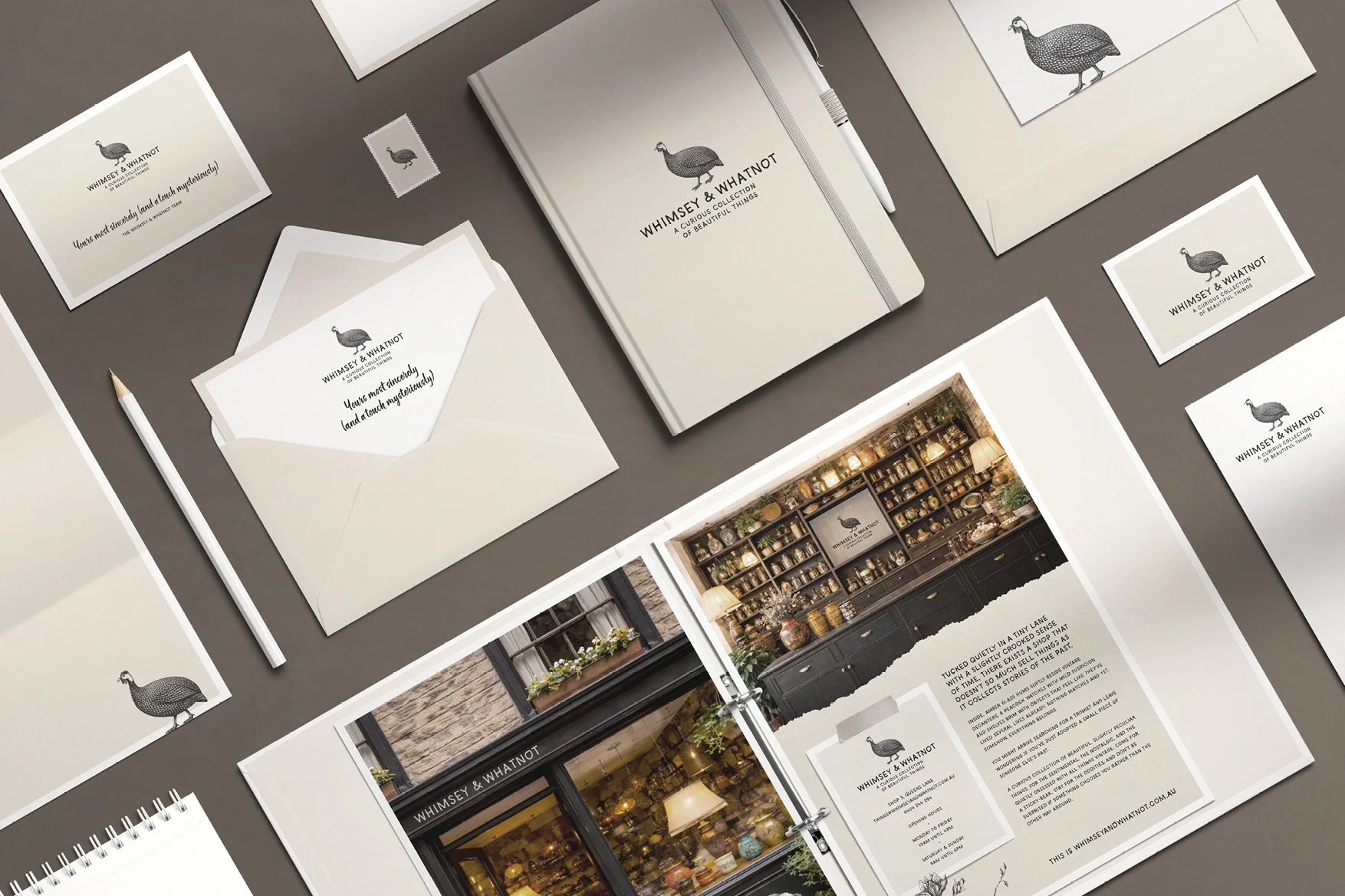
WHIMSEY & WHATNOT, COMING 2027
PROJECT
BRANDING, STATIONERY, PRESS ADS, ONLINE STORE
The Brief
Whimsey & Whatnot required a brand and print collateral suite to reflect its curated collection of vintage and character-filled homewares, with the end goal being a bricks and mortar shop to complement their online store.
Our Approach
We created a warm, tactile visual identity using soft neutrals, classic typography and layered layouts, supported by illustration and storytelling-led imagery.
The Outcome
The result is a distinctive, cohesive brand that captures the store’s charm and elevates the retail experience across web, print and stationery.

CLIENT
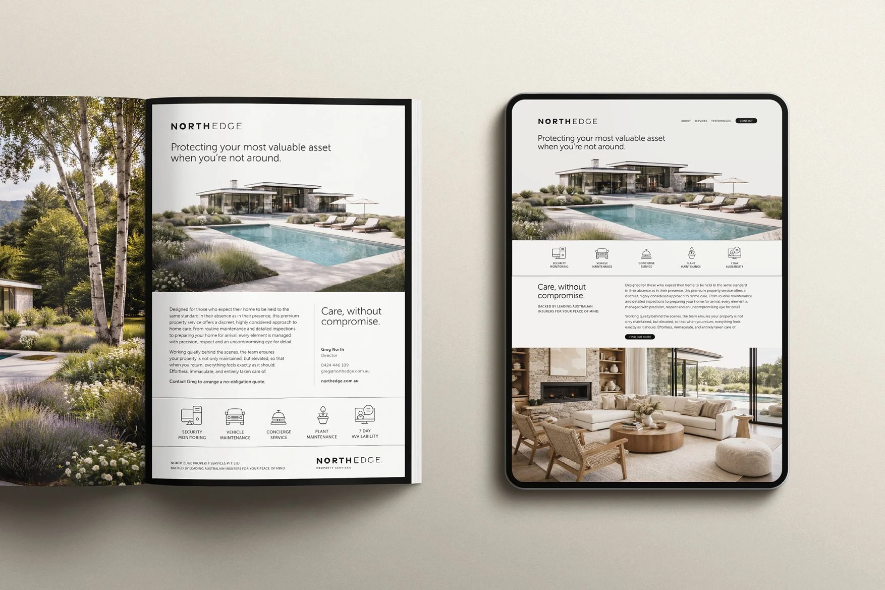
NORTH EDGE PROPERTY SERVICES, GIPPSLAND
PROJECT
BRANDING, WEBSITE, SOCIALS, PRESS ADS
The Brief
North Edge Property Services required a brand and marketing suite to position its property services for premium properties throughout Gippsland, as trustworthy, high-end and detail-focused.
Our Approach
We developed a clean, architectural visual language using refined typography, neutral tones and aspirational imagery to communicate care, precision and quality.
The Outcome
The result is a cohesive, elevated brand presence that builds trust and clearly positions North Edge within the premium property market.

CLIENT
FISHY FESTIVAL 2027, FISH CREEK
PROJECT
BRANDING, WEBSITE, POSTERS, PHOTOGRAPHY
The Brief
Fishy Festival required a bold campaign identity and collateral to promote its Easter weekend program and attract a broad regional audience.
Our Approach
We created a striking visual system using high-contrast imagery, a limited palette and strong typographic hierarchy to unify diverse events under one identity.
The Outcome
The result is a memorable, cohesive campaign that captures attention, drives engagement, and clearly communicates the festival offering.


CLIENT
CORNER INLET FISH CO., GIPPSLAND
PROJECT
BRANDING, MENU, WEBSITE
The Brief
Corner Inlet Fish Co. required a brand and in-store collateral to better reflect its fresh, local seafood offering.
Our Approach
We created a clean, coastal visual identity using a restrained palette, classic typography and detailed illustrations to evoke quality and provenance.
The Outcome
The result is a distinctive, easy-to-recognise brand that enhances in-store experience and reinforces a trusted, local brand.

CLIENT
PROM COAST FESTIVAL, GIPPSLAND
PROJECT
BRANDING, PRESS ADS, SOCIALS, WEBSITE
The Brief
Prom Coast Festival needed a cohesive brand and campaign to bring together a diverse program of events under one clear, compelling identity that would attract both locals and visitors.
Our Approach
We created a warm, lifestyle-led visual language centred on connection, place and experience, using candid photography and simple, inviting messaging. The system was designed to flex seamlessly across print, digital and social while maintaining a strong, recognisable voice.
The Outcome
The result is a vibrant, unified campaign that captures the spirit of the region, builds anticipation, and drives engagement across multiple touchpoints, positioning the festival as a must-attend annual event.


CLIENT
WANDERING WILD, TASMANIA 2027
PROJECT
WEBSITE, PRESS ADS
The Brief
Wandering Wild needed a brand and digital presence that could capture the emotional pull of Tasmanian slow travel, and position its experiences as something deeply considered, not just another itinerary.
Our Approach
We leaned into a restrained, editorial style, pairing immersive landscape photography with minimal typography and generous spacing to create a sense of calm and intention. The narrative-led structure invites users to explore at their own pace, mirroring the brand’s philosophy.
The Outcome
The result is a distinctive, atmospheric identity that feels more like a journal than a travel site, building desire, encouraging deeper engagement, and positioning Wandering Wild as a premium, experience-led offering.


CLIENT
PANDESAL BAKERY, GIPPSLAND
PROJECT
WEBSITE, SOCIALS
The Brief
Pandesal Bakery required a new website and campaign assets to showcase its artisan offering and attract both locals and destination visitors.
Our Approach
We created a rich, immersive visual experience using dark tones, strong imagery and simple typography to let the product take centre stage.
The Outcome
The result is a warm, engaging brand presence that highlights quality, builds appetite, and encourages both in-store visits and online orders.


CLIENT
ORYN TECHNOLOGIES, COMING 2027
PROJECT
WEBSITE, SOCIALS
The Brief
Oryn Technologies needed a modern digital presence to clearly communicate a complex SaaS offering, positioning the platform as both powerful and easy to understand for enterprise users.
Our Approach
We designed a clean, data-led interface that simplifies complexity through structured layouts, bold metrics and intuitive feature groupings. The visual language leans into clarity and confidence, ensuring consistency across desktop and mobile experiences.
The Outcome
The result is a streamlined, high-impact platform that makes complex data accessible, reinforces credibility, and supports confident decision-making across all user touchpoints.


CLIENT
PROM MEATS, GIPPSLAND
PROJECT
WEBSITE, SOCIALS
The Brief
Prom Meats needed a brand and digital presence that could elevate a traditional butcher into a premium, experience-led offering, without losing the authenticity and craft at its core.
Our Approach
We built the identity around rich, moody photography and restrained typography to hero the product and the process. The art direction focuses on texture, hands-on preparation, and provenance, letting the quality speak visually while simple, confident messaging reinforces trust and expertise.
The Outcome
The result is a bold, modern brand that positions Prom Meats above the everyday butcher, driving appetite, reinforcing quality, and creating a consistent visual language across digital, in-store and social touchpoints.


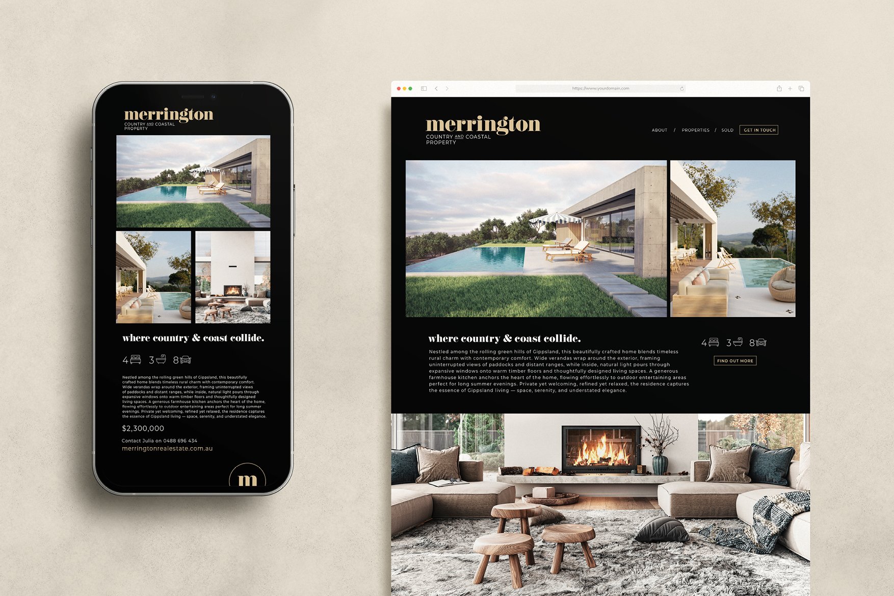
CLIENT
MERRINGTON REAL ESTATE
PROJECT
BRANDING, WEBSITE, BOARDS, POSTERS
The Brief
We partnered with Merrington Real Estate to create a premium real estate brand from the ground up, one that would reflect a distinct position in the market, specialising in high-end country and coastal properties.
Our Approach
We developed a refined brand identity and narrative centred on the idea of “where country and coast collide,” capturing the unique lifestyle proposition of the region. From there, we designed and delivered a complete ecosystem: brand, website, campaign materials, property marketing, signage, and digital assets, ensuring every touchpoint felt cohesive, considered, and unmistakably premium.
The Outcome
The result is a confident, elevated brand that positions Merrington as a leader in its industry. With a seamless experience across digital and physical channels, the brand not only enhances individual property marketing, but builds long-term equity and recognition in a competitive market.

CLIENT
GIPPSLAND VET GROUP, GIPPSLAND
PROJECT
WEBSITE, SOCIALS
The Brief
Gippsland Veterinary Group needed a refreshed digital presence that could unify multiple clinics and services while clearly communicating trust, care, and local expertise to a broad audience.
Our Approach
We structured the experience to balance professionalism with warmth, using approachable photography, clear service segmentation, and intuitive navigation to help users quickly find what they need. The design system brings consistency across locations while maintaining a friendly, community-focused tone.
The Outcome
The result is a clean, accessible platform that strengthens brand cohesion, improves usability, and supports both client engagement and service growth across the network.


CLIENT
NCDX, INTERNATIONAL
PROJECT
BRANDING, STATIONERY, PRESS ADS, SOCIALS
The Brief
NCDX needed a brand and communications system that could translate a complex, data-driven platform into something clear, credible, and meaningful for a broad mix of national and international stakeholders, from farmers to policymakers.
Our Approach
We developed a clean, structured identity grounded in clarity and trust, pairing minimal typography with considered agricultural imagery to humanise the data. Messaging focuses on connection and shared insight, supported by a flexible system that works across print, digital and stakeholder communications.
The Outcome
The result is a confident, future-focused brand that simplifies complexity, builds credibility, and positions NCDX as a leader in connected, data-driven livestock management.


CLIENT
ONE LIFESTYLE REAL ESTATE
PROJECT
BRANDING, STATIONERY, LANDING PAGES, SOCIALS, MARKETING COLLATERAL, LIVERY, MERCHANDISE
The Brief
We partnered with One Lifestyle to create a distinctive real estate brand from inception, designed to support both immediate market presence and long-term franchise growth.
Our Approach
We developed a confident, approachable identity grounded in lifestyle-led positioning, balancing professionalism with warmth and accessibility. From there, we built a comprehensive brand system designed to scale, spanning digital platforms, marketing collateral, social templates, signage, vehicle livery and franchise materials. Every element was created to ensure consistency, ease of use, and strong brand recognition across multiple locations and touchpoints.
The Outcome
The result is a cohesive, highly adaptable brand that supports both day-to-day marketing and long-term expansion. With a systemised approach across digital and physical channels, One Lifestyle is equipped to grow with clarity, consistency and confidence.


CLIENT
HOMELESSNESS WEEK, CONCEPTUAL
PROJECT
CONCEPTUAL VISUAL SYSTEMS, COPYWRITING
The Brief
We were asked to create a conceptual campaign for Homelessness Week that would cut through apathy and reframe public perception, shifting the narrative from statistics to real human stories.
Our Approach
We developed a concept-led visual system using light as a symbol of safety and shelter, contrasting harsh, real-world environments with simple, illuminated forms. Paired with direct, emotive headlines, the campaign focuses on dignity, empathy, and the lived reality of homelessness rather than cliché tropes. Our second concepts utilised human imagery with bold copywriting.
The Outcome
The campaign delivers a powerful, human-centred message that captures attention, sparks emotional connection, and encourages meaningful engagement and support.

